Media Blog

Thursday, 6 October 2016

School Photography Convention Ideas


These are several images that are appropriate for my school magazine cover. These photographs are taken exactly as how the school they are representing would want. I hope to take inspiration from these photographs for my own magazine image.

Wednesday, 5 October 2016

Magazine "Mock Up" Front Covers


I've tried to create two different front covers, which differ in their main image and the amount of text on each cover. In  my first cover (Left), I have included my PB Magazine masthead, along with a faded background image of a pile of books. I feel that these two elements contrast well with each other, thus making my magazine more visually appealing and appropriate for my target audience.. For my strap lines, I have stuck to a certain font and colour scheme(Black text for the main strapline with blue additional text). My main headline is also quite large, taking up the bottom third of my magazine. I feel this emphasises the importance of the contents of my headline and the meaning behind it. I've also included a bold Starburst and banner at the bottom of this cover. These features are incredibly effective in grabbing attention, which is what I hope my magazine will do.

My second cover (Right), has a completely different feel from the first. To start, there is much less text on the cover. I feel this is a good contrast to have, as it shows the importance of how much text should be on a magazine. I have also re-arranged the spacing of my Masthead, Headline and strap line in order to experiment with the positioning of the various features. By doing so, I feel I have gained more knowledge on the difference re -arranging these features can have.The lack of text, I feel, signifies the value of the Headline and strap line, thus making the reader aware of the amount of content these topics will take up within the magazine. My Starburst is situated in the top right hand corner, which I feel draws more readers to it due to its unique nature.

I also received some feedback whilst constructing these covers. I was told that my Masthead was too small and insignificant in comparison to everything else on my cover. In response to this feedback I added a darker black to my masthead and increased its size. By doing this, I feel that I have brought significance to my Masthead, and hopefully encouraged it to be the first thing my audience will be drawn to.

Thursday, 29 September 2016

Front Page Layouts


Here are six of my front cover designs for my school magazine that all follow the conventions found on a typical magazine. I feel that each of my designs are varied, and include a variety of different aspects that will make my magazine different and unique. I feel that the most important aspect to my magazine is my masthead, as its the first feature on my magazine that the reader will be drawn to. That is why I've given the mastheads most of the space on each of my magazine covers. I want people to get a sense of professionalism when viewing my magazine, which is why I haven't overloaded each cover with content, as i feel this takes away from the professional aspect I'm trying to achieve.

I want my image to be subtle yet vibrant.Through my analysis, I believe that my image has to represent a topic in the magazine, but it cant be too overwhelming that it outshines the other aspects on my front cover. In terms of text, there should be some over the image, such as various lures, strap lines and a pug, but again they should not be too bold or overwhelming that they take away from the image. I feel that my image and masthead would work well together. I think that my image should be masking the masthead to signify its importance.  

Tuesday, 27 September 2016

Mastheads for School Magazine


These are my Mastheads that I've created in Adobes Fireworks. All of these Mastheads follow the schools branding.I feel I have done a good job representing the school via my mastheads as I have tried to stick to the schools colours of Red and Black. I have also taken inspiration from a variety of other magazines, such as Billboard and Q magazine. I feel that I have appealed to my target audience in many ways. For example, in my third masthead I have included a variety of bright colours. This was to try to appeal to the younger readers of my target audience,as children tend to be drawn to brighter, more vibrant colours. While constructing my mastheads, I checked the Plantsbrook website to see the different fonts used. By doing this, I feel that all my mastheads are applicable to represent the school. 

Friday, 23 September 2016

Moodboard For School Magazine


What to Include In a School Magazine

A school magazine should include a variety of things, covering different aspects of school life. Some ideas of what to include are:

  • A contents page 
  • A guide for new year 7's and how to settle in
  • An information page for parents
  • An information page for students 
  • Transportation available to school (i.e School Buses)
  • Different articles allocated to the different years. For example, years 7, 8, 9, 10, 11 and the 6th form would have separate articles relating to them.
  • A guide for students during exam season, with different strategies to cope with stress.
  • A page dedicated to the Staff around school and their roles
  • Various extra-curricular activities available in school

Tuesday, 20 September 2016

Masthead Analysis


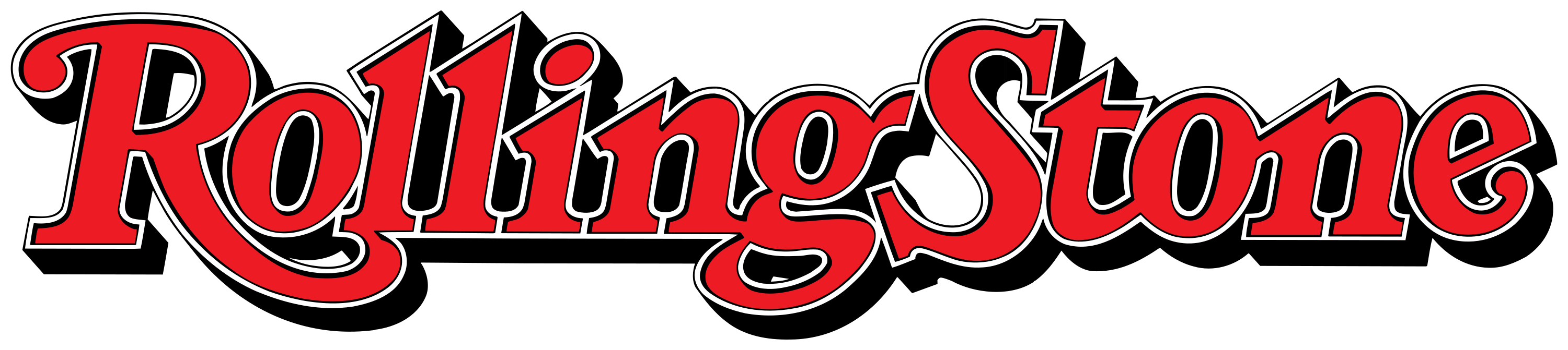
Image result for rolling stone magazine logo


This is the Masthead for the magazine "Rolling Stone". The same iconic Masthead is used in every issue of the magazine, and retains the same font style and colour palate. There is almost a metallic tone to this logo, which combined with its curled letters of "R" and "G", make it instantly recognisable. There is also a drop shadow used behind the masthead, giving it a three dimensional look, and in particular, making the colour red pop and draw the reader to it. The connotations of the colour "red" are quite dangerous, which makes the reader think that this magazine is not afraid to talk about taboo topics. It also has a Serif form. I believe this is done to add a more retro look to the magazine, as the band "The Rolling Stones" is a fairly old band, in which the masthead plays with.

Image result for Kerrang logo
This is the Masthead for the magazine "Kerrang". The design used in this masthead represents the onomatopoeic nature of the title. The word Kerrang sounds like something breaking, which is represented in the masthead through various lines splitting up the title, thus visually making it look like its about to break. The contrasting colours of black and white are extremely visible and bold. This can link to the magazines genre of heavy metal as the boldness and "in your face" appearance link well with the heavy metal category. The connotations of the word black are quite brooding and dark, which again, links in well with the genre and target audience of the magazine. It also has a Sans -Serif form. I think this is to again add to the onomatopoeic nature of the title, as it stand out more with a sans serif form.


This is the Masthead for the magazine "Vibe". This design is very much a sans-serif form shown by its block letters. Vibe covers a variety of music genres, which is why its masthead is somewhat simplistic as it doesn't fall into any particular music category. The use of the matt black colour gives the masthead a bold undertone. The word "Vibe" suggests that this magazine gives out different feelings to its readers and has an atmosphere. This can suggest that the contents within the magazine (i.e articles) is able to give out certain "Vibes" to its readers.